Overview
Since branding includes the visual representation of Cross City Church, care must be applied in the way that it’s used. Each time it’s seen in a public setting, it represents our church and our name. We want to be good stewards of the brand, so these guidelines will unify the way that we utilize it.
How it applies…
- The branding and its variants must be used within standard usage guidelines as described in the communication guide.
- General Ministries will adopt a standard branding, and should be used as described in this document.
- Strategies within the general ministries may adopt alternate logo designs in collaboration with the Communications department.
What is Branding & Why Should I Care About It?
What is branding?
Branding isn’t just a logo and colors. Branding is the experience we deliver, it’s how we leave people feeling.
Why should I care?
We are one church with one central message and one brand. Communicating like a collection of ministry silos independent of the church as a whole is contrary to our mission and crippling to our brand.
Things we do that communicate separation:
- Competing brands (separate logos, colors, visual identities across ministries)
- Out of brand communication and promotional materials
Cohesion helps us prevent confusion for our audience. Visual cohesion creates familiarity and communicates unity.
Brand Stewardship
To continue to grow our influence and brand recognition, we must do everything consistently, at every service, event, and campus, and that’s the purpose of this guide—to help synchronize our understandings and efforts for our mutual long-term success.
Although it’s the responsibility of the Communications team to be experts in the Cross City brand, everyone on staff is a steward of our brand. We’re here to empower and equip you to handle our brand carefully, confidently, and with excellence.
We’ve created guidelines to ensure consistency across all of our communication. We’ve identified the essential visual elements of our brand—our logo, color palette, typography, and graphics—and our voice. The following content provides an overview of our brand’s identity and shows its application on several communication pieces.
Style Guide: Logo
Logo Files

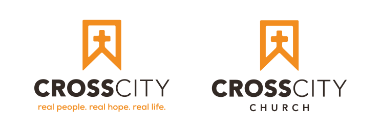
There are two separate orientations of the Cross City logo: stacked and horizontal. Copies of our logo files are located in Teams under Teams > Support – Communications.
When resizing a logo, drag from the corner only (while holding the Shift key) to maintain the correct proportions.
Color
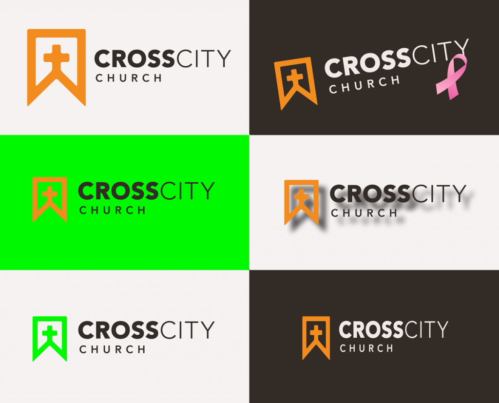
In most instances, the official logo should be reproduced in the official look and color (orange and brown).
However, there are exceptions when we will use color variations of the logo, depending on the promotion. The Communications team MUST approve any color changes to the logo.
White and black versions of the logo are available to use as well in official capacities.
Other Logo Usage
Contact the Communications team to help coordinate other applications of the logo (such as stickers, decals, t-shirts, etc.)
Safe Area

The presentation of the full logo of Cross City is enhanced by a reasonable amount of space surrounding the entire mark. This area, referred to as the control area, should remain clear of all graphic imagery, edges, folds, and other nonessential visual elements.
A minimum control area is approximate to the height of the logo.
Minimum Size
The minimum size for reproducing the
horizontal logo is 1.75” wide with the tagline and 1” without the tagline.
Incorrect Usage
Never use the logo as demonstrated above. Improper use of the logo as it relates to elements, including color, scale, letter case, and backgrounds, will lead to utter brand destruction. Therefore, adhering to these rules maintain the consistency and integrity of the brand and delivers value to the people in our community.
Backgrounds
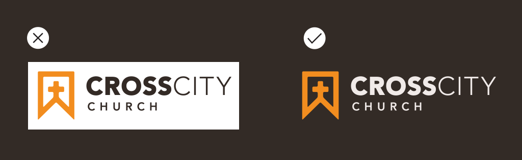
Use a transparent background when necessary. White boxes around our logo look sloppy.
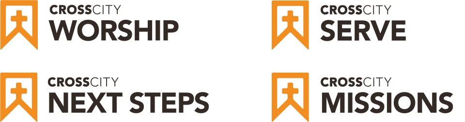
Style Guide: Ministry Logos

Style Guide: Fonts & Typography
Fonts
We recommend using Montserrat and/or Source Serif Pro for all designs. If you would like to use another font, please submit to the Minister of Art & Design for approval.
Guidelines for font usage
Brush/Script fonts: Use sparingly. Do not use in all caps. Limit usage to a title/header. Do not use as body copy. Submit to the Minister of Art & Design for approval.
Display fonts: Use sparingly. Submit to the Minister of Art & Design for approval.
Typography
Body copy should be 9-10 points and left-aligned in printed documents. Use Montserrat or Source Serif Pro as your font for all body copy.
Don’t use more than two typeface families in any one design.
Use bold or italic as little as possible, and not together.
Never underline text.
Don’t center body copy.
Why? Centered text forces your eyes to work harder to find the beginning of a sentence every time you start a new line.
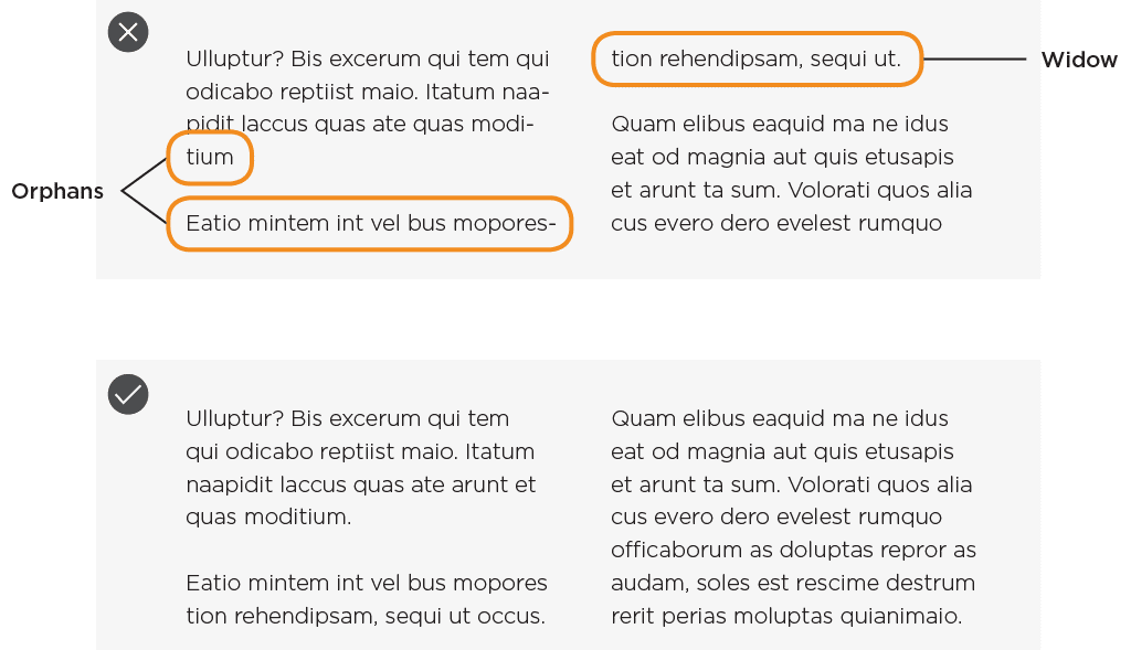
Take care of widows and orphans
An orphan is a very short line—usually one word, or the end of a hyphenated word—at the end of a paragraph or column.
A widow is a single word, part of a word or very short line, except it appears at the beginning of a column or a page.
Widows and orphans are considered poor typography because it leaves too much white space between paragraphs or at the bottom/top of a page. This interrupts the reader’s eye and diminishes readability. See below for examples.
Style Guide: Colors
Primary Brand Colors
There are three primary colors for the Cross City brand. One of these colors must always exist within the logo and collateral items. The only exception is an all-black or all-white logo at the discretion of the Communications team.

Hex: #F38B00 |

Hex: #332B26 |

Hex: #EEE8E5 |
Ministry Colors
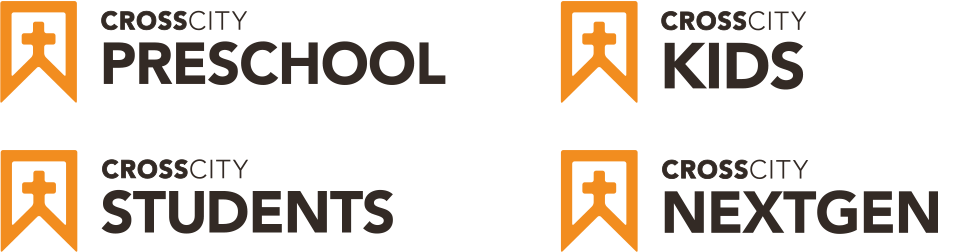
Each ministry has a branding color that they may use in their logo to distinguish them from other ministries while remaining aligned to our brand.

PreschoolHex: #81BC41 |

KidsHex: #f2c31a |

StudentsHex: #cc3736 |

SinglesHex: #00BCB4 |

Young AdultsHex: #00837E |

AdultsHex: #326195 |

WomenHex: #96539a |

MissionsHex: #4e7637 |

WorshipHex: #693575 |